A platform built around delegation
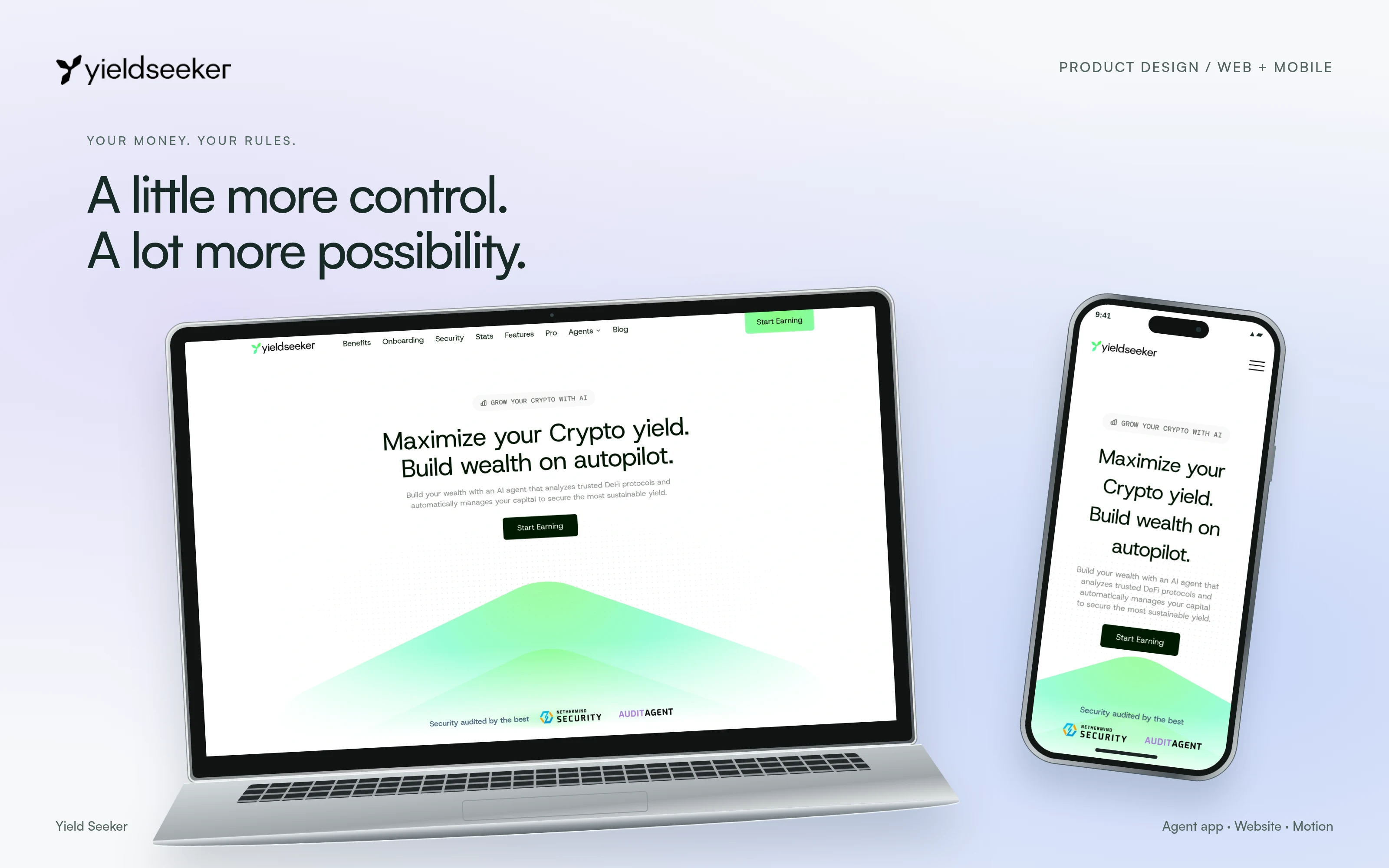
I started on Yield Seeker in January 2026, designing the Vault and Borrow platform. The agent bots came later, in October. Vault handles supported yield allocations and Borrow extends the platform into borrowing. I led product design across the app and website, and carried the same story into motion explainers and an investor deck.
I worked with Arthur Fox and Krishan, the founders and stakeholders. We agreed on one idea early: people should not feel they have to watch yields or pick them by hand. The agent does that work, inside the controls the product supports.
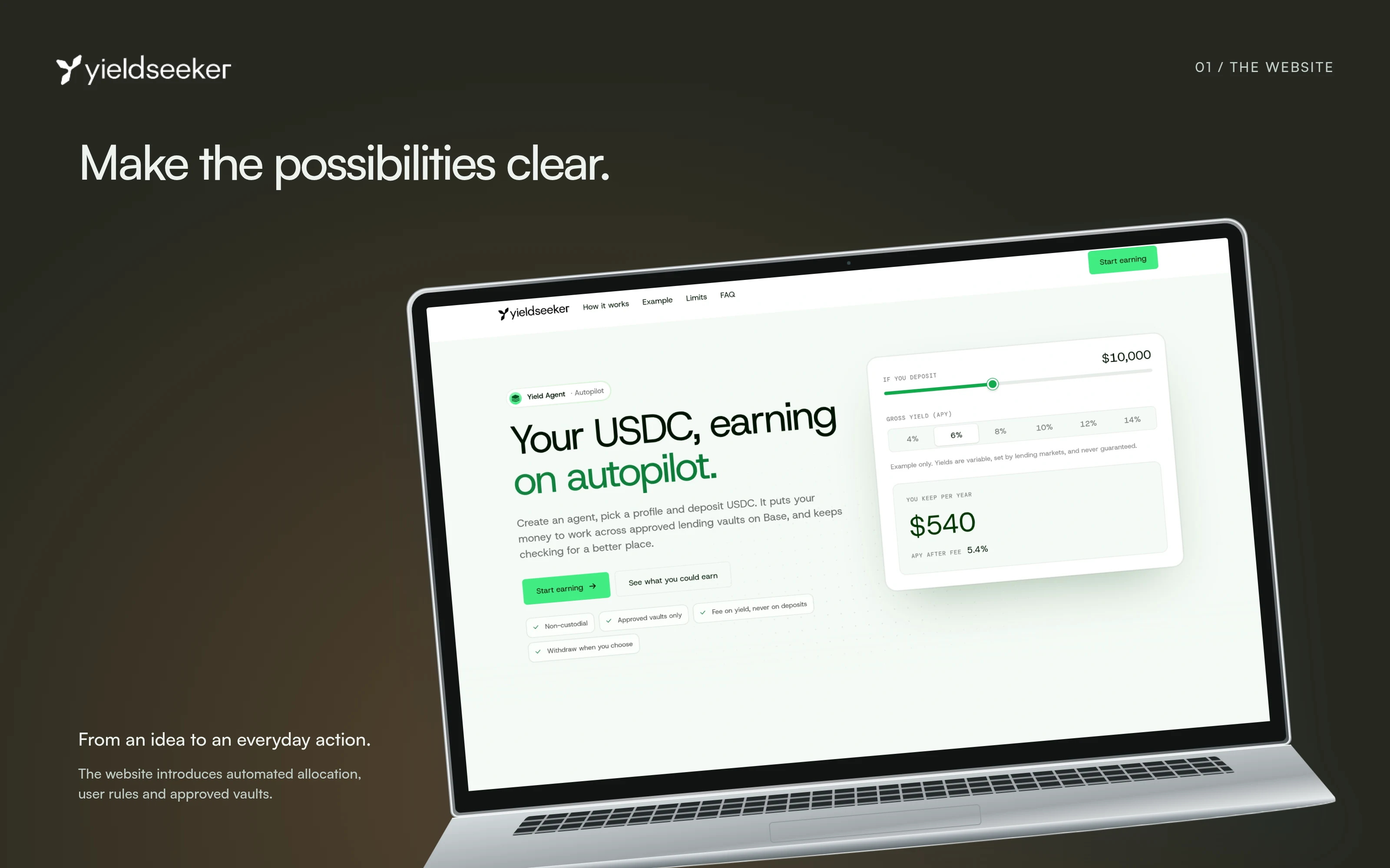
A dashboard can give the work straight back
A screen full of rates makes an automated product feel like another job. If every vault looks like something to compare and pick, the interface hands the user the work the agent is meant to take. The product had to explain delegation without inviting constant monitoring.
The rebrand set a second requirement. The product had to match the leaf identity and not look like a typical DeFi finance dashboard. Everything should feel like it is continually moving and going up, while the user's money and controls stay easy to read.
Start with what the person needs to decide
I worked through the path of creating an agent, funding it, following its activity and changing its preferences. I kept the line between the person's decisions and the agent's ongoing work at the centre of the app. The dashboard shows that work without making manual yield selection the main task.
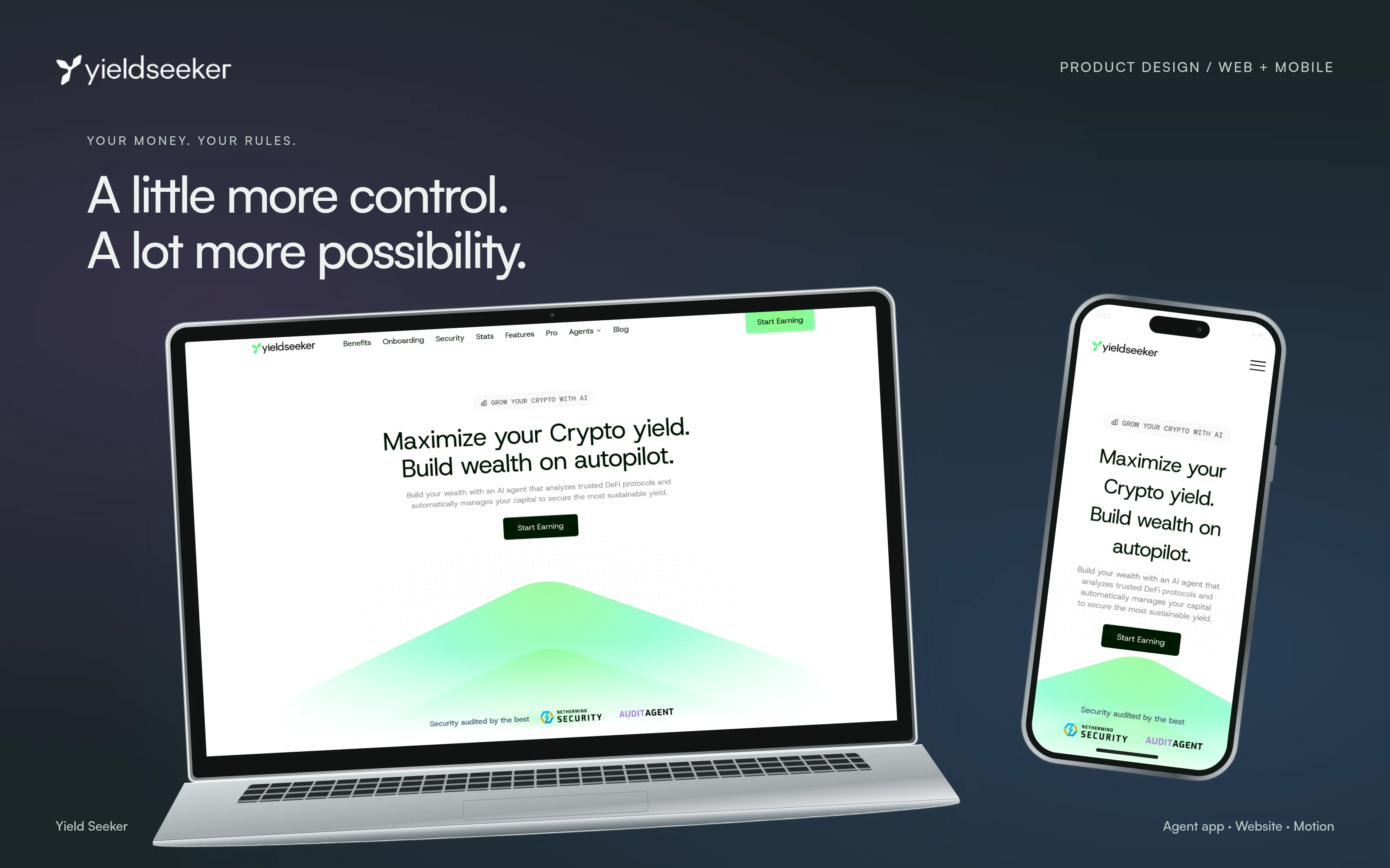
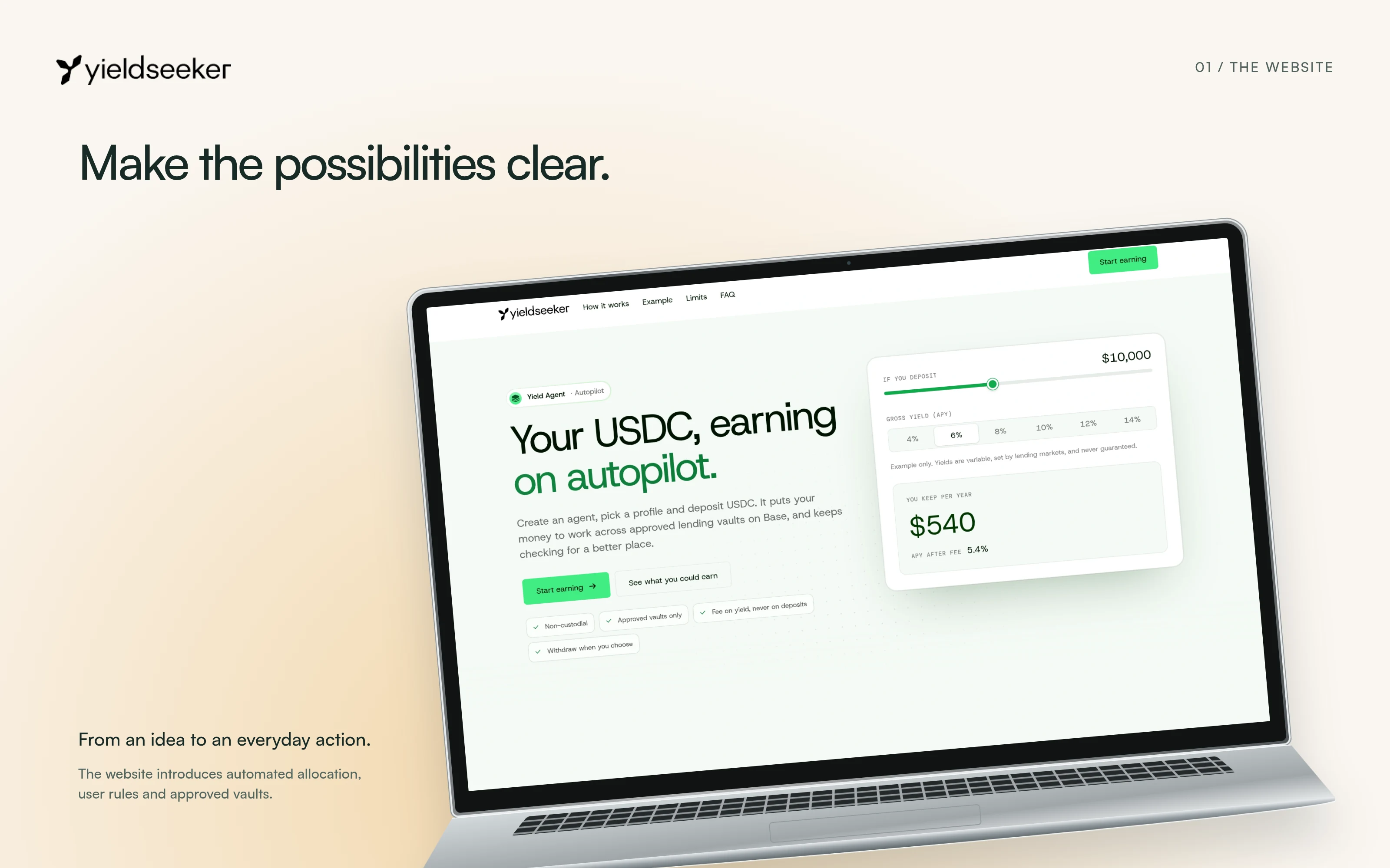
I brought the leaf identity into the website's green visual direction and motion. The use-case pages explain the product before someone reaches the app.
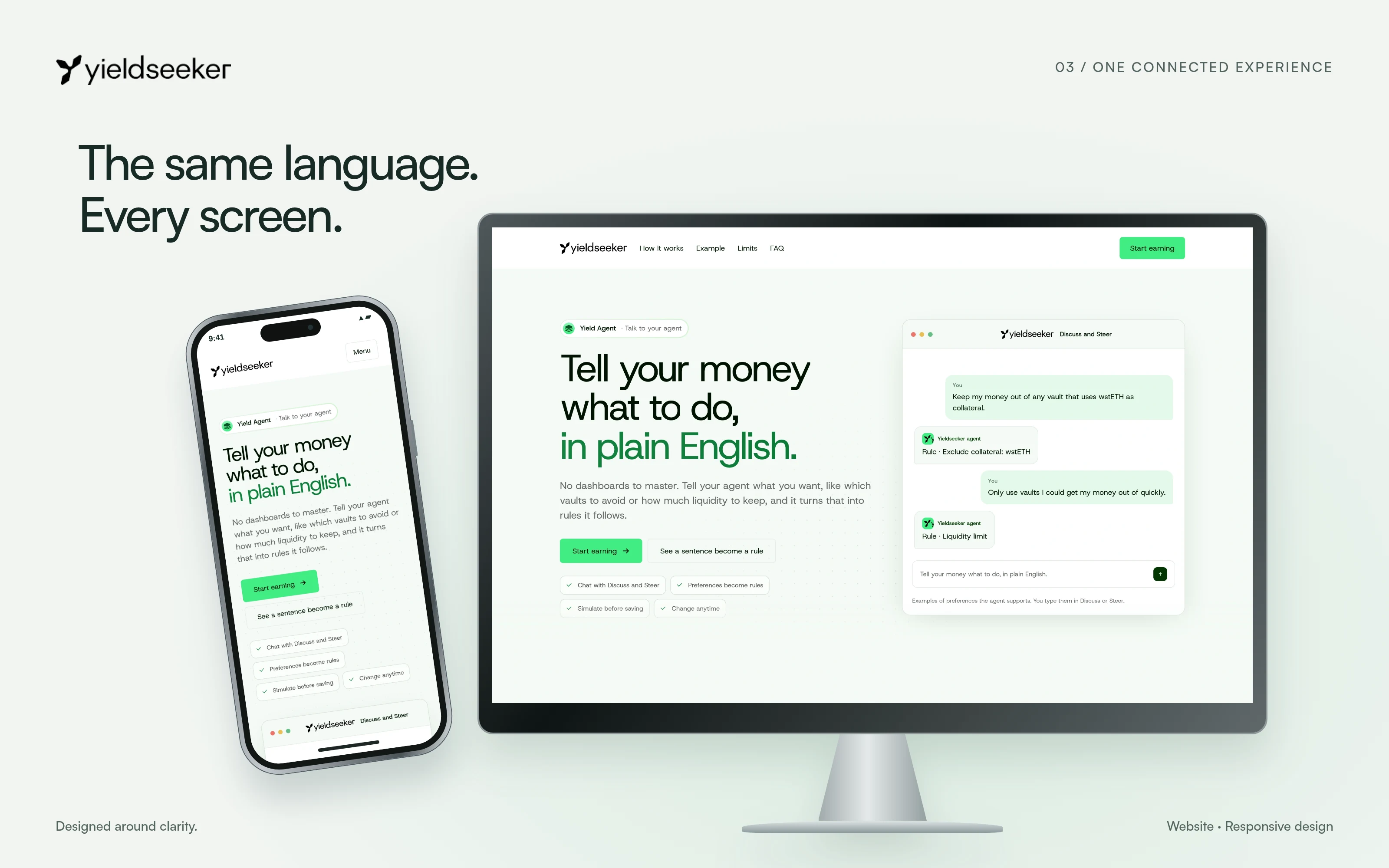
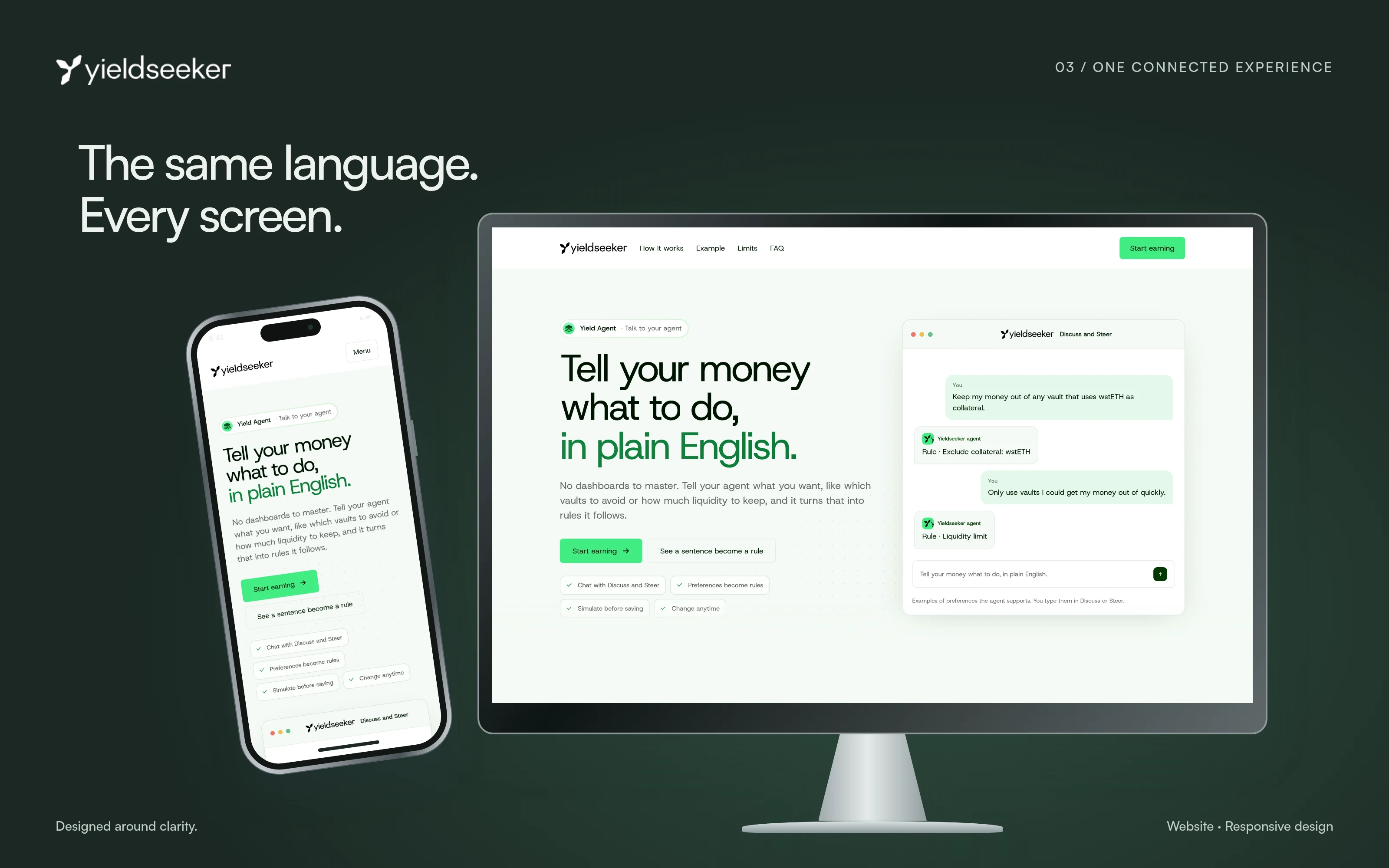
Make movement feel reassuring without promising returns
Constant upward movement is a visual direction, not a promise that returns always rise. People still need to inspect what the agent is doing and change their preferences, and I had to give them that without a wall of financial controls.
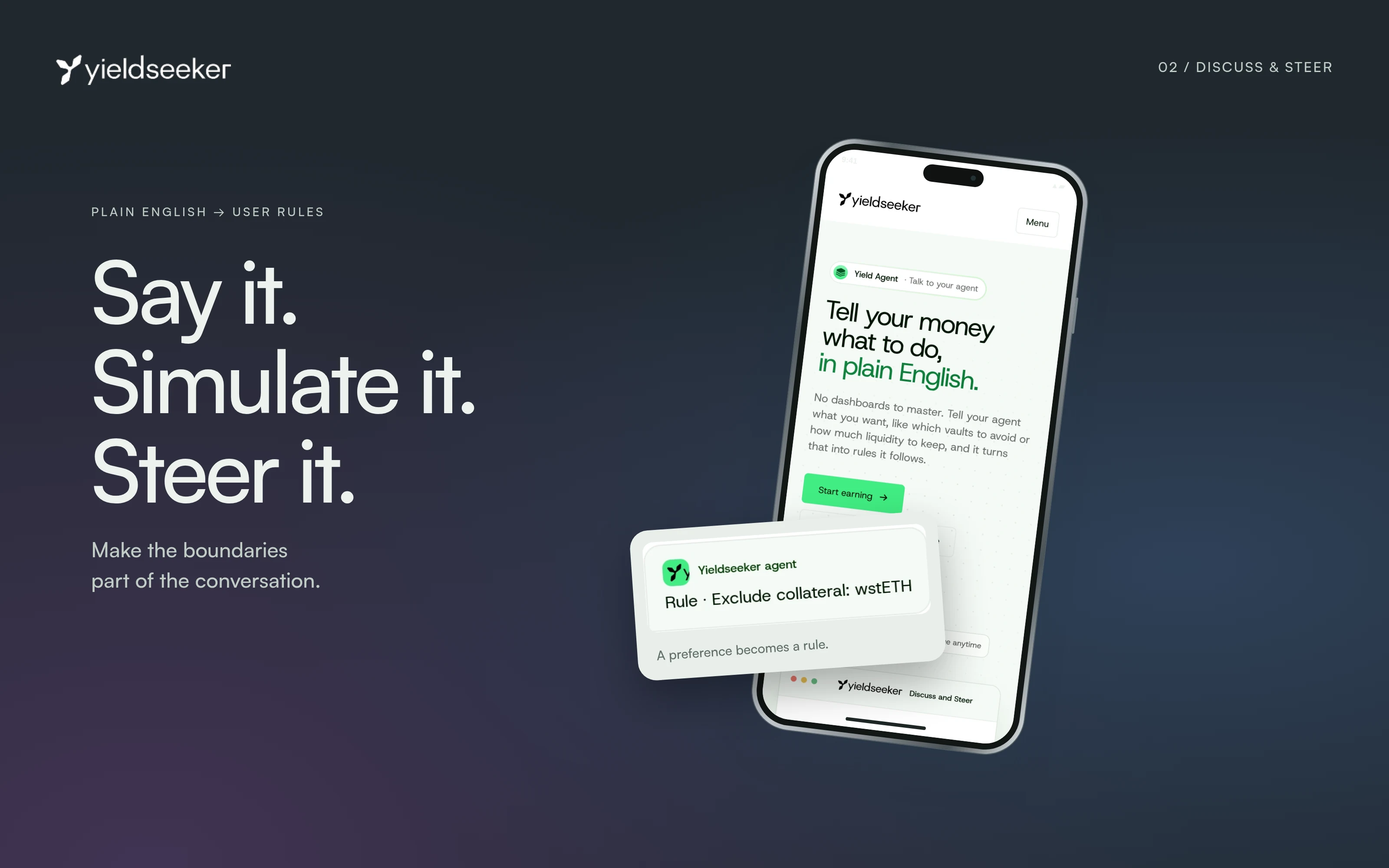
Discuss and Steer needed a clear boundary. A plain-language request is not an active instruction. The product supports specific rules, and a simulation shows a possible allocation before they are saved. That preview must not read as money already moved or a guaranteed result.
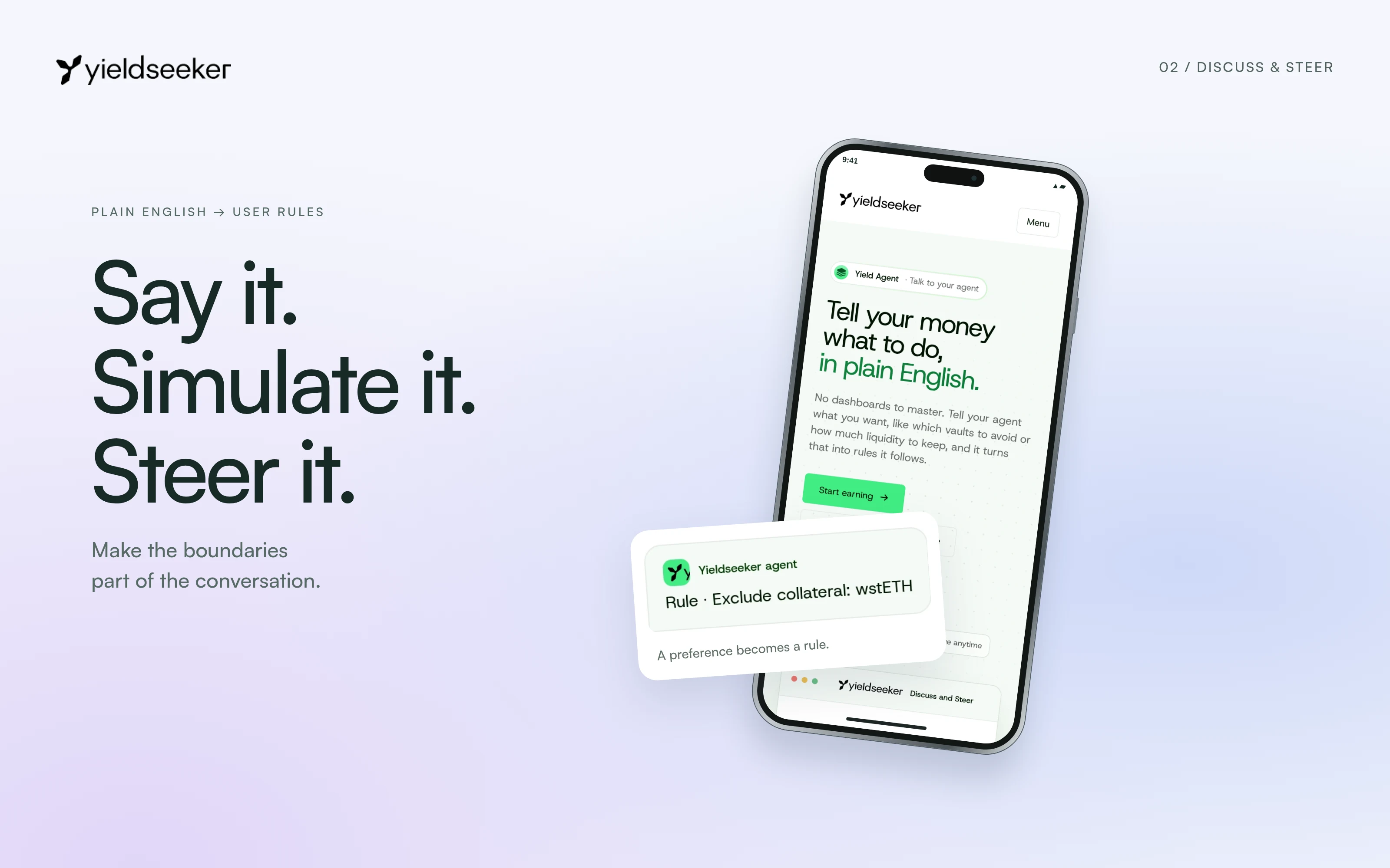
Keep the activity visible and the controls deliberate
I designed the dashboard and activity feed as places to understand the agent's work. In Discuss and Steer, a person states a preference and reviews a simulation before saving supported rules. The website explains those controls in the same visual language as the app, so the introduction and the product tell one story.
I also designed the investor deck's narrative and slide layouts. As of 22 October 2026, Yield Seeker had 5,413 agents and 250,740 transactions, with $315.5M in volume.
Delegation needs to show up in the interface
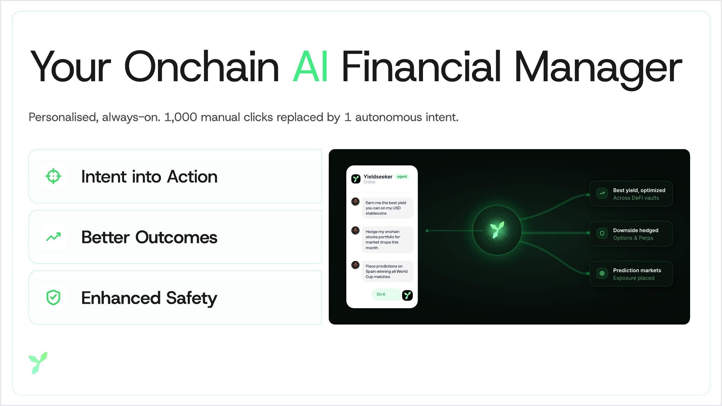
Automation changes what deserves attention. Giving every yield opportunity equal prominence works against the product. The person needs to understand the agent and its limits without feeling responsible for every allocation.
I also learned to be careful with movement. Motion can reassure, but it should never suggest a result the product cannot promise.
Based on my original Yield Seeker case study ↗ and the product website ↗. Reviewed November 2026. Screens show the version documented in this case study.