A small study of an existing financial app
I worked on Bitnob usability research during the 2024 African UI/UX Bootcamp in Nairobi. The bootcamp brought together ten designers. During the Africa Bitcoin Conference, we tested the existing app with five participants across four reported flows.
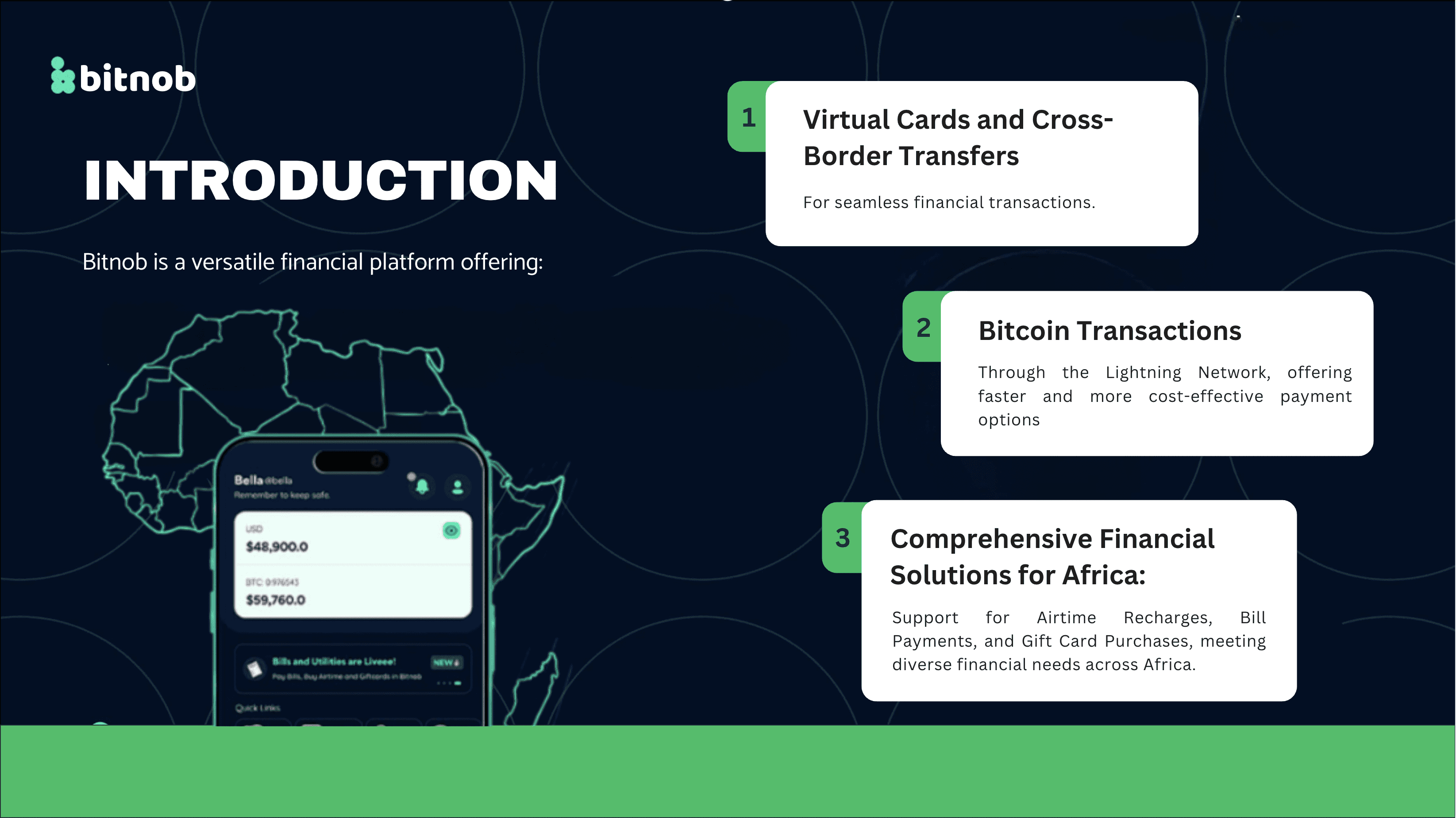
We studied onboarding, Bitcoin transfers and purchases, and collected feedback and subjective ease ratings on a seven-point scale. My work was research into the existing app.
Getting to a transfer can be the difficult part
Bitnob connects Bitcoin and Lightning transfers with everyday financial tasks. I wanted to understand the whole task, including the steps before someone can use the service. A fast transaction says nothing about whether verification or navigation was easy.
Our slides tie onboarding friction to KYC and purchase friction to bugs or unclear flows. They also credit fast transactions and a clean interface. The picture is more specific than calling the whole app difficult.
Pair task feedback with the original slides
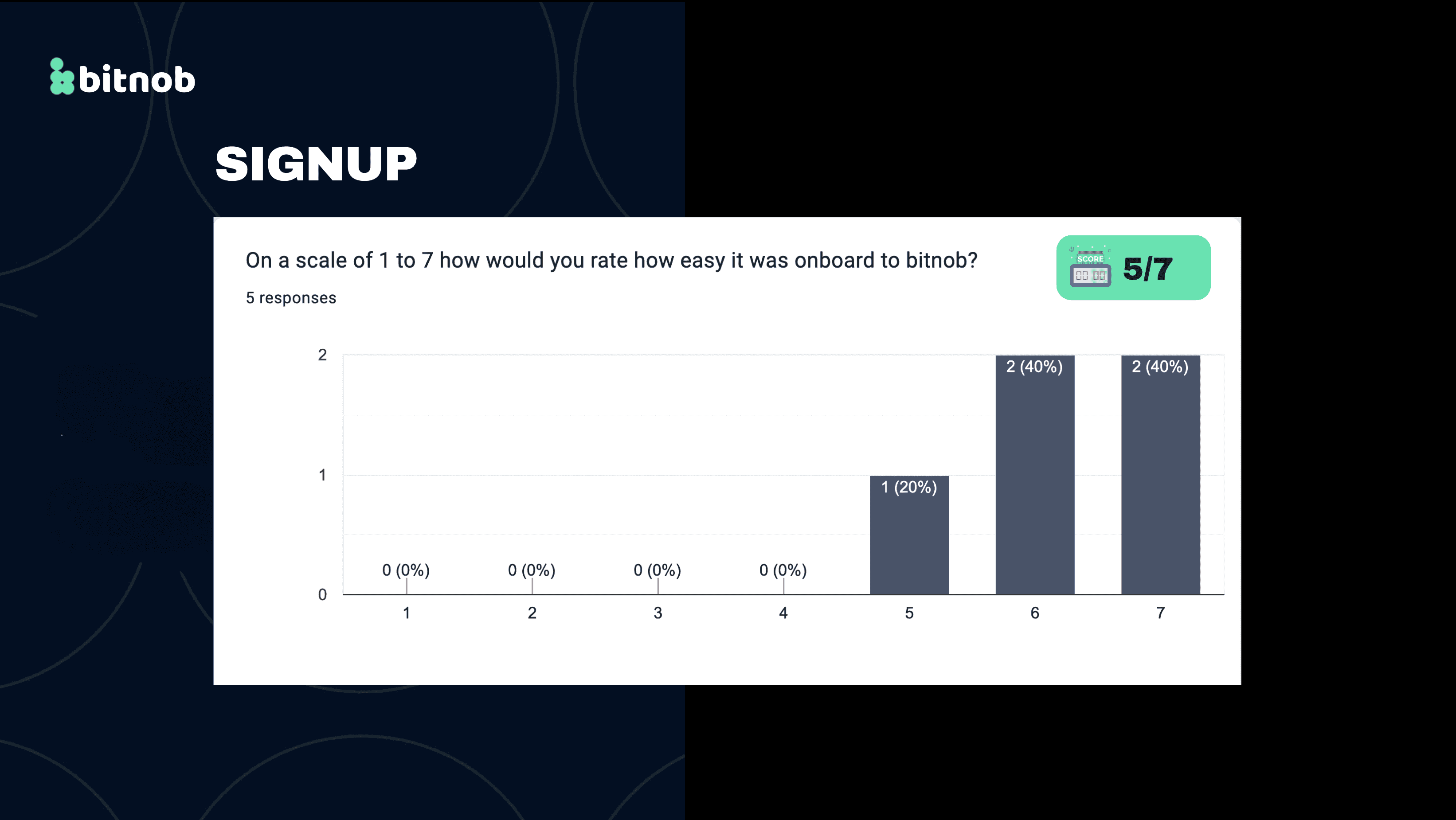
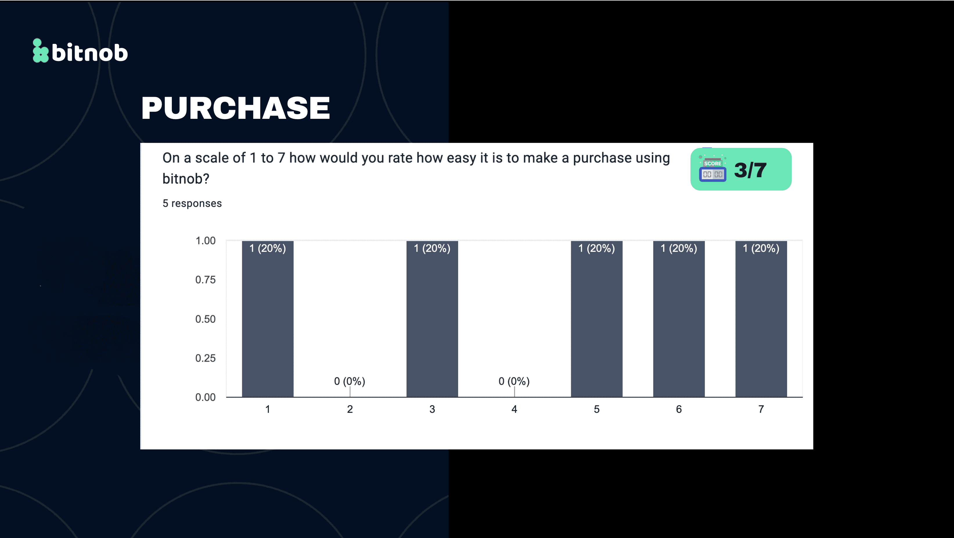
We ran task-based usability evaluations and collected ease ratings alongside feedback. The original slides sit beside the story as the record of how we presented the results. Each chart shows five responses.
I read the task feedback next to the ratings. The comments about verification and purchase failures showed where the experience needed attention.
Separate the friction from the strengths
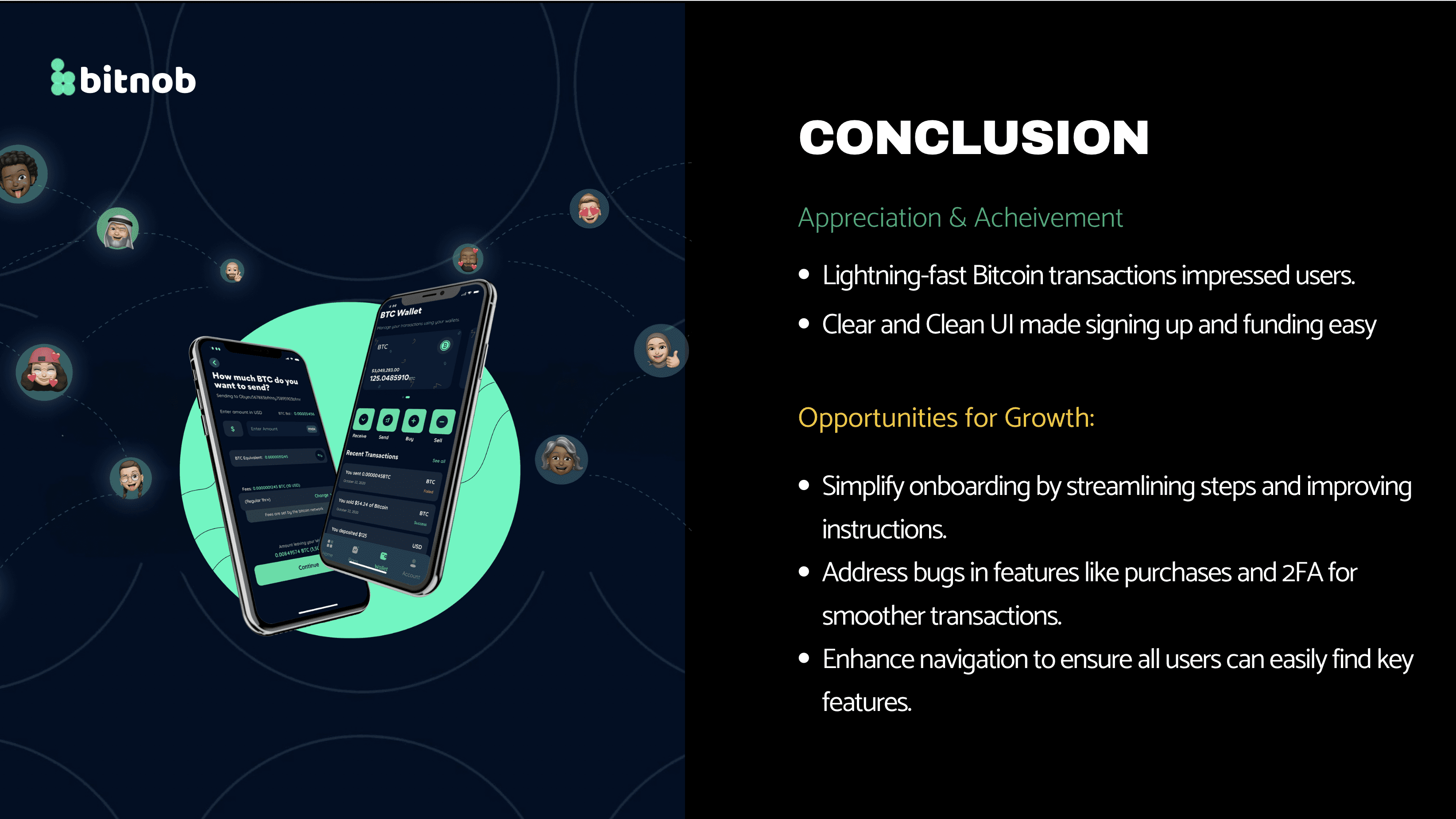
Participants liked the fast transactions and clean interface, while onboarding and purchases exposed friction. I kept both findings in view so the recommendations addressed specific tasks.
The purchase responses varied widely, which made the individual feedback especially useful.
Turn the findings into recommendations
Our research output called for clearer onboarding instructions and better navigation. The conclusion slide also recommends fixing purchase and 2FA failures. The recommendations stay close to the recorded problems and do not assume verification requirements can simply be removed.
The output was a set of research recommendations. I focused on changes that fix the reported friction and keep the fast transfers participants valued.
Keep the findings as specific as the evidence
This study taught me to look at the complete task. Praise for transaction speed can sit alongside real difficulty with onboarding or purchases, and both matter.
It also showed me that a small study with a defined task still gives specific, usable findings.
Based on my original African UI/UX Bootcamp case study ↗. Reviewed November 2026. Screens show the version documented in this case study.