One order, three people looking at it
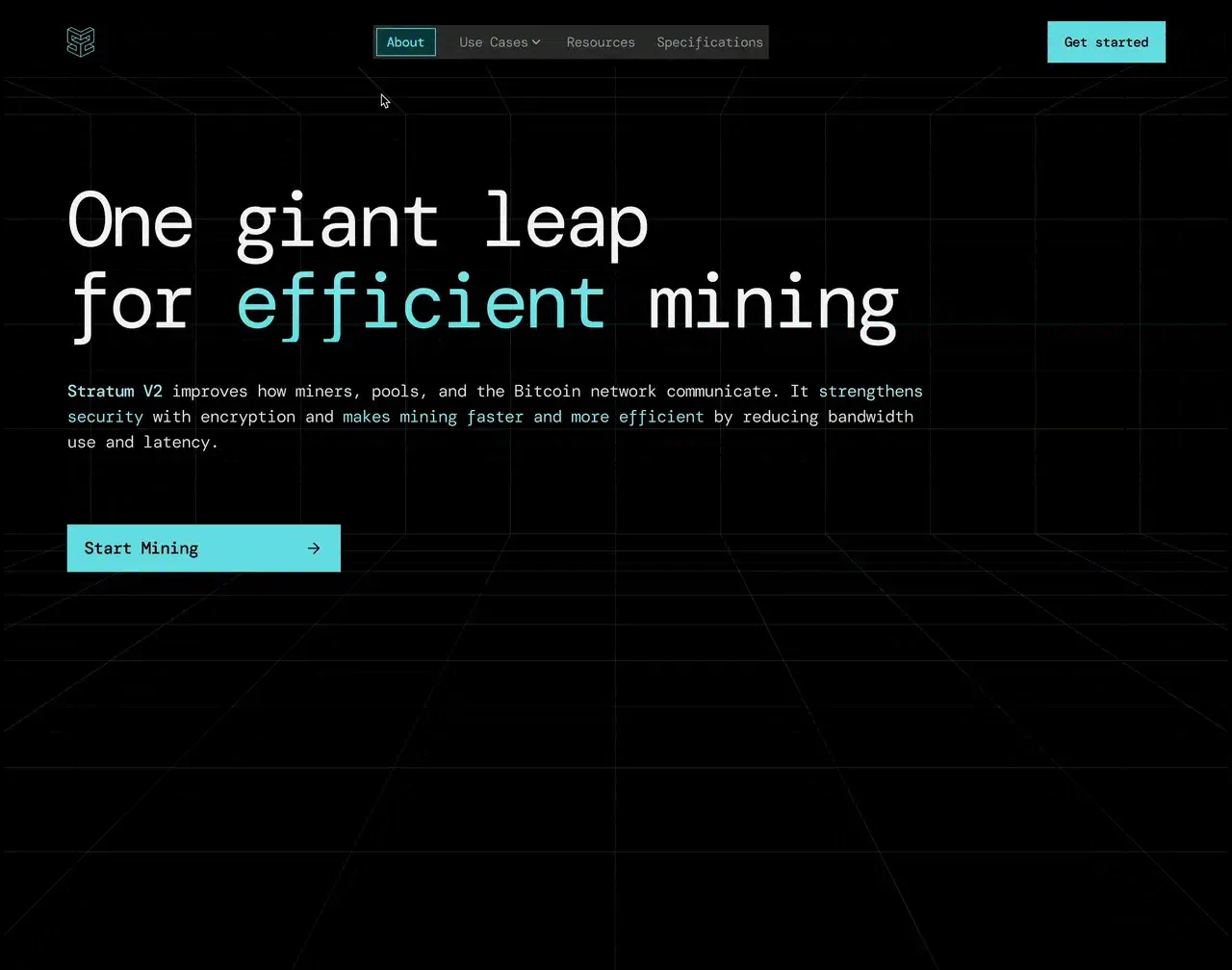
Let me start with what Swigo is and how I got involved. Swigo Logistics is a delivery service in Lagos, run by its parent company Swiftmedix. It is live at swigologistics.com and still in progress. A customer books a pickup, a rider collects the parcel and an operations team coordinates the trip in between. All three look at the same order from a different screen.
I joined in November 2026 as design engineer, so I designed the screens and wrote the front-end code for them. Over eleven days I authored 64 of the repository’s 75 pull requests, all merged. They cover the customer site, the rider app, the pharmacy portal that came later and the operations workspace. I also made the film that plays on the Swigo homepage, shown below.
- 64 of 75
- pull requests in the repo, authored by me and merged
- 11 days
- 8 to 18 November 2026
Everything looked the same, so nothing was clear
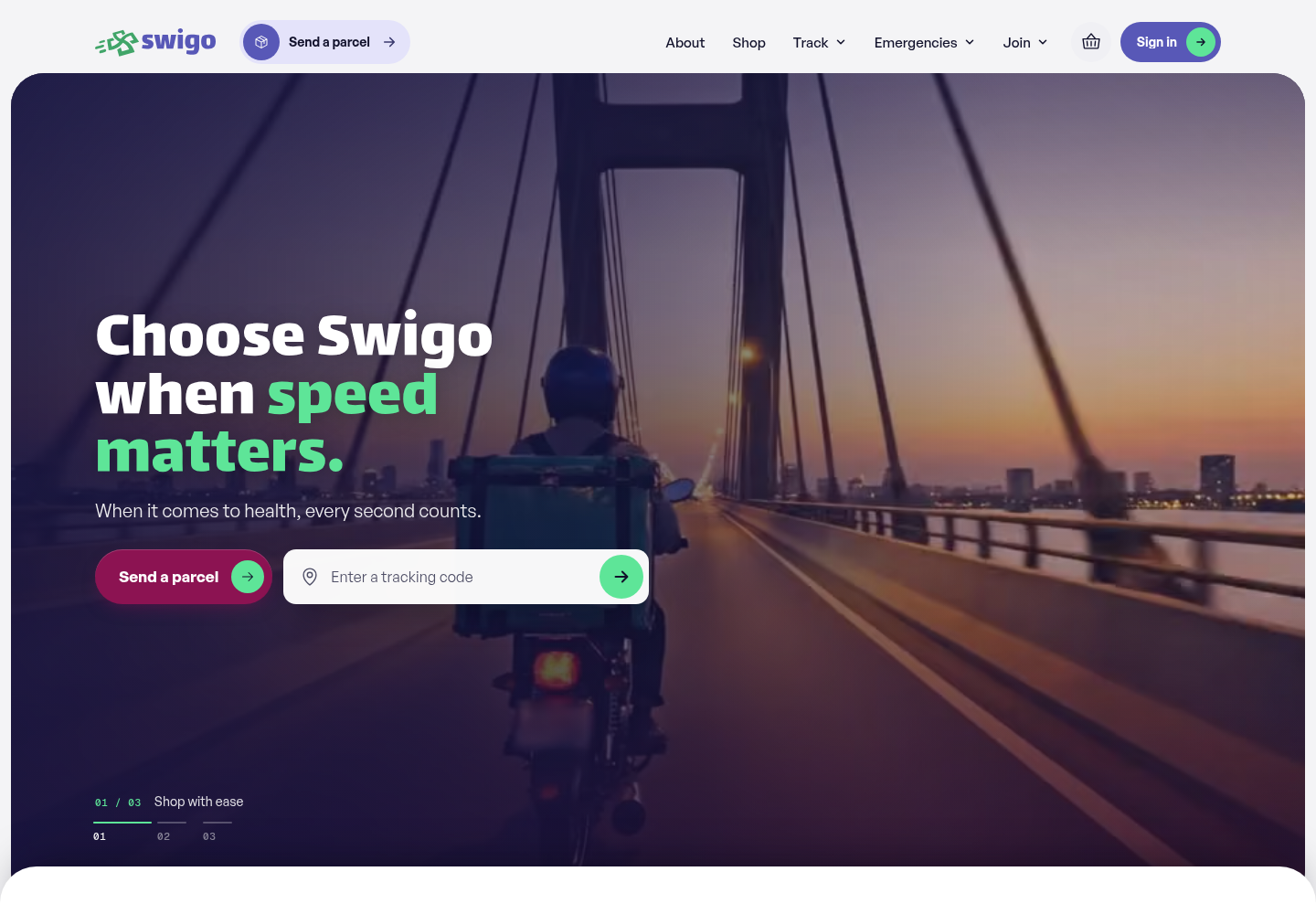
This section is about what I found when I audited the apps. Each one had grown its own style. I counted 53 corner radii, 126 shadows, 65 font sizes and 237 hard-coded colours, with two separate form systems. A button, a filter, a tab and an address field were all the same white pill, so people could not tell what was tappable.
Phones made it worse. Header links wrapped onto a second row, and on a 390 pixel screen the tracking map escaped its box and stretched to 435 by 1928 pixels. For a rider reading a screen in the sun, or a customer checking where their parcel is, that kind of mess costs real time.
- 237
- hard-coded colours across four apps
- 53
- different corner radii
- 65
- font sizes
Give every colour and shape one job
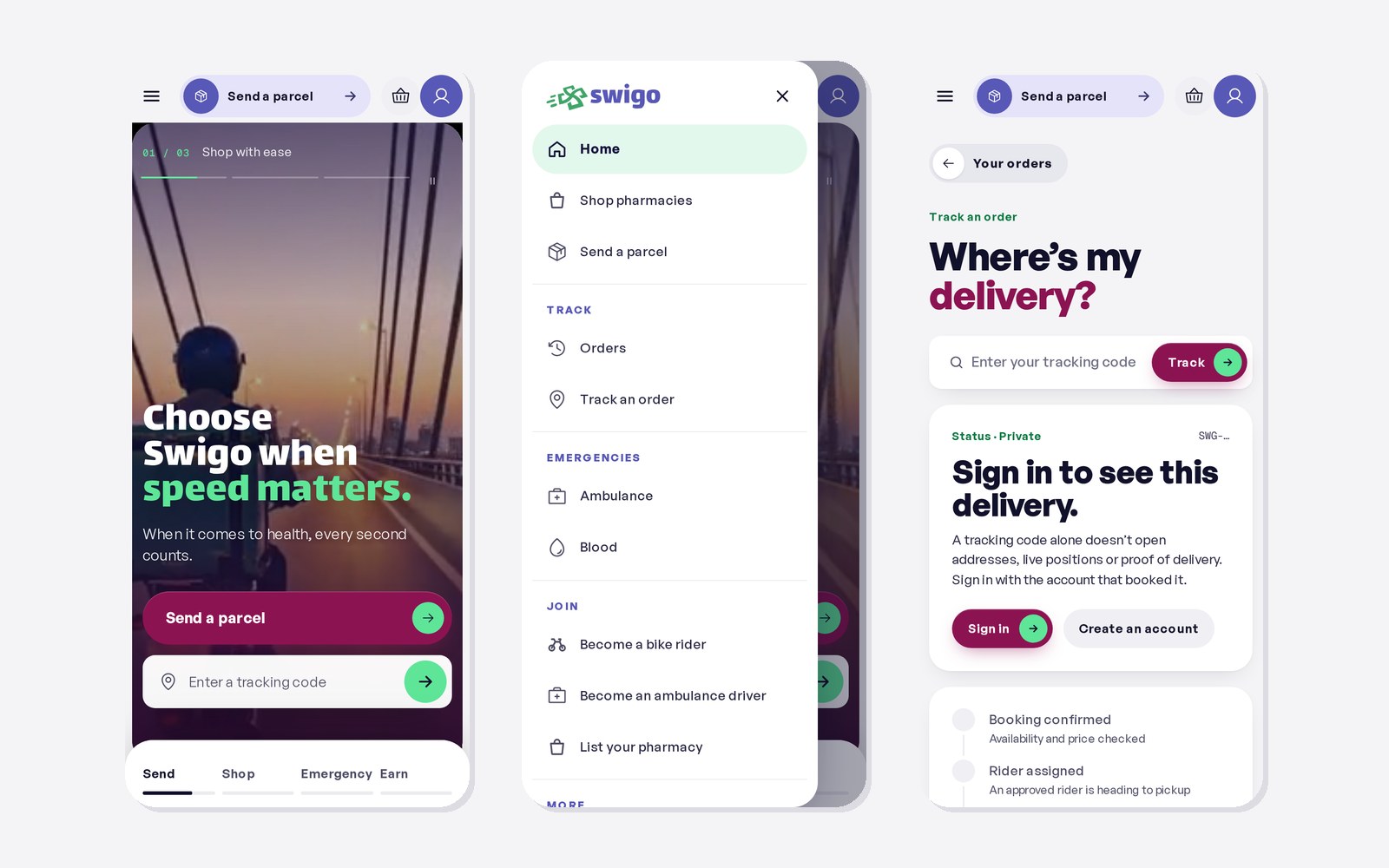
Here is how I decided what to change before touching individual screens. I wrote a design direction that the whole team, and every later change, had to follow, then put it into the code as shared styles and components. Plum means do this, and appears once per screen. Indigo means go there. Mint means live or done. Buttons are pills, tabs are never pills, and fields are the only things with an edge.
The rule I cared about most was words first, colour second. Every state shows a plain word, like You’re online or Waiting 12 min, and colour only backs it up. Riders often read on cracked phones in bright light, and a colour on its own is easy to miss.
The screen can only promise what the system knows
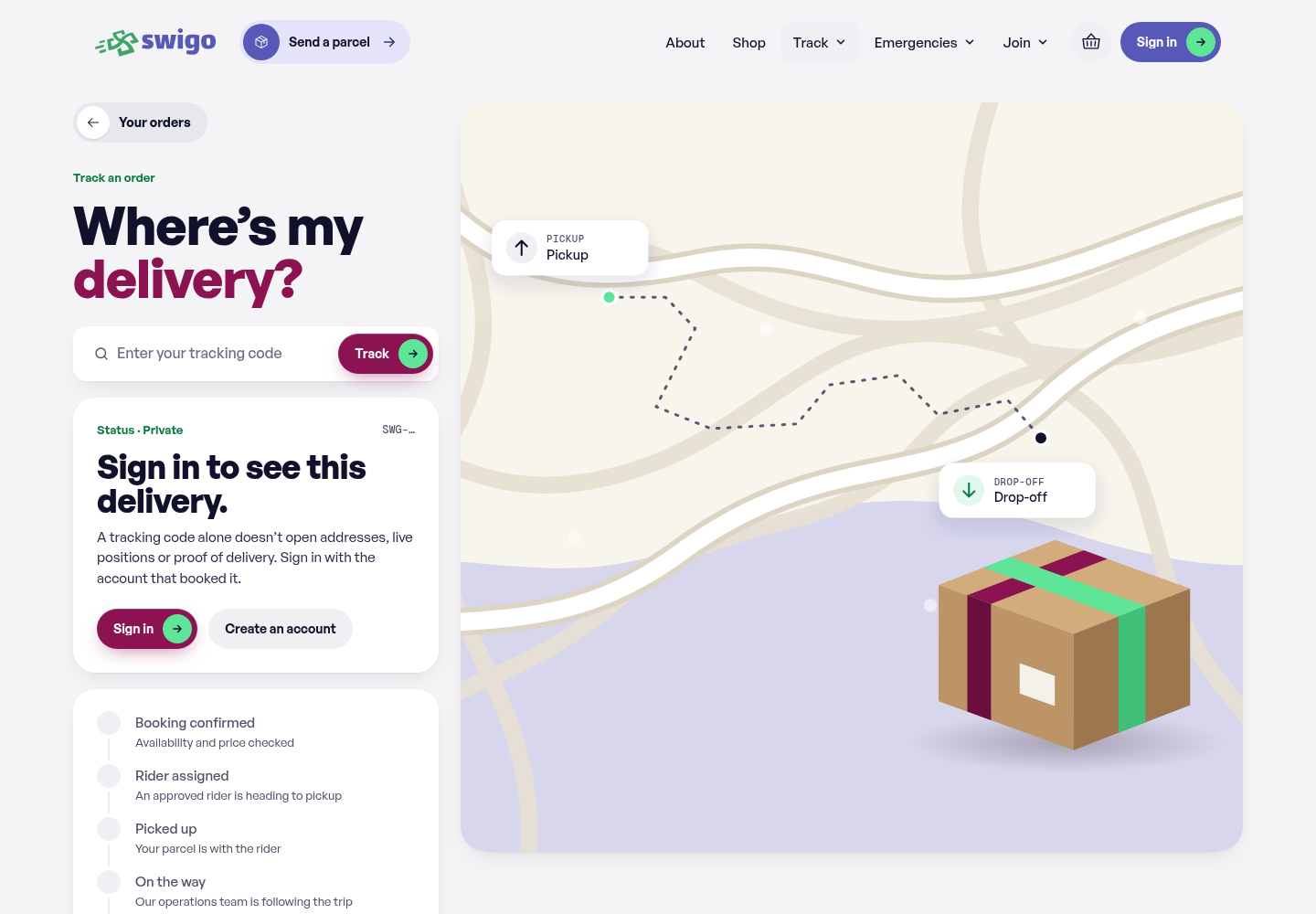
The hardest part of this project was honesty, and this section covers why. A customer returning from checkout has not necessarily paid; the backend has to verify it first. A rider who is offered a job has two minutes to accept, and the delivery is not theirs until they do. Live GPS pauses when the rider leaves the page.
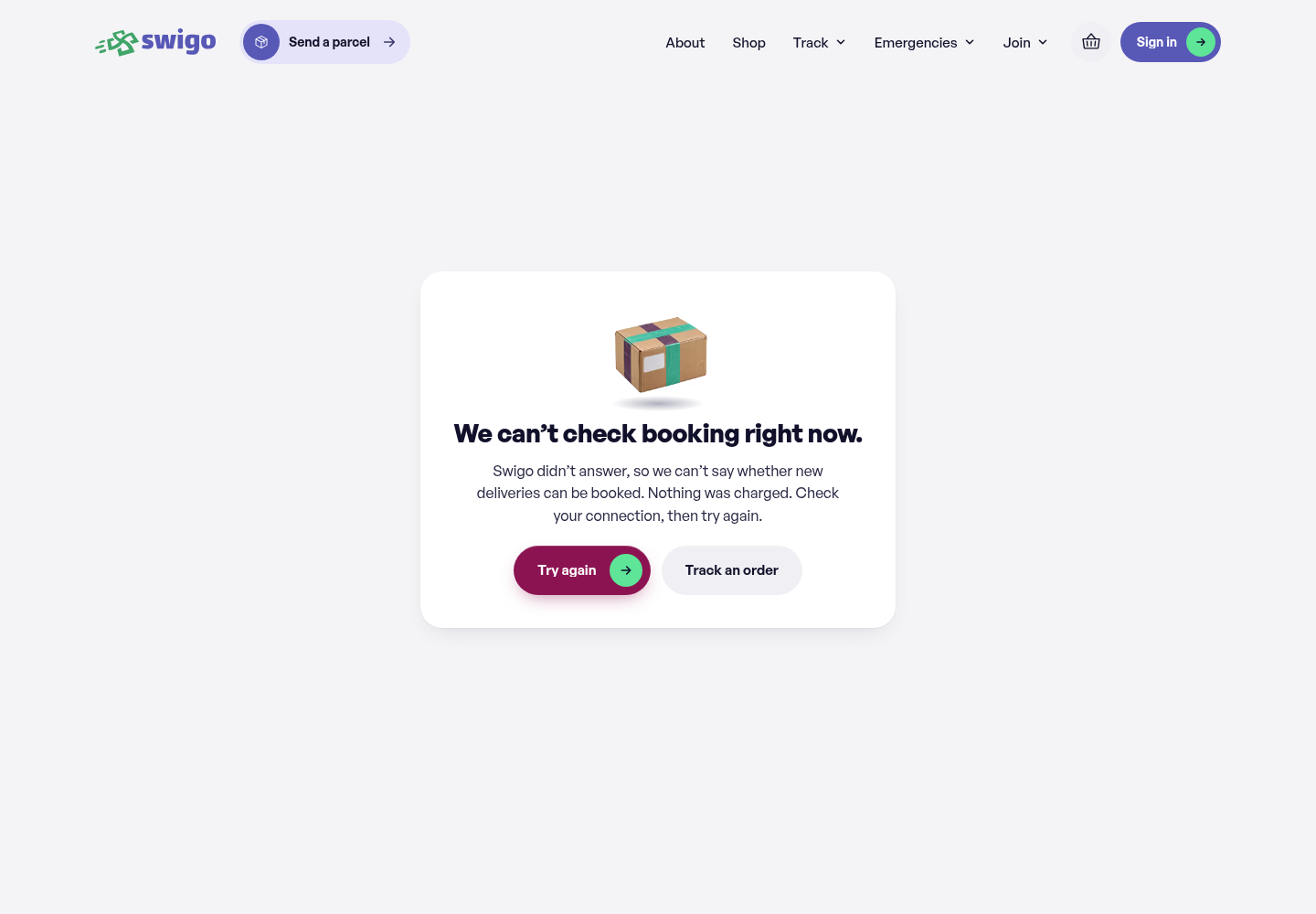
Each of those moments could easily show a reassuring screen that turns out to be wrong. So I designed the in-between states as carefully as the happy path. When the booking service cannot answer, the page says so, offers a retry and confirms that nothing was charged.
- 2 min
- for a rider to accept a job offer before it moves on
Shorter first steps and a visible next step
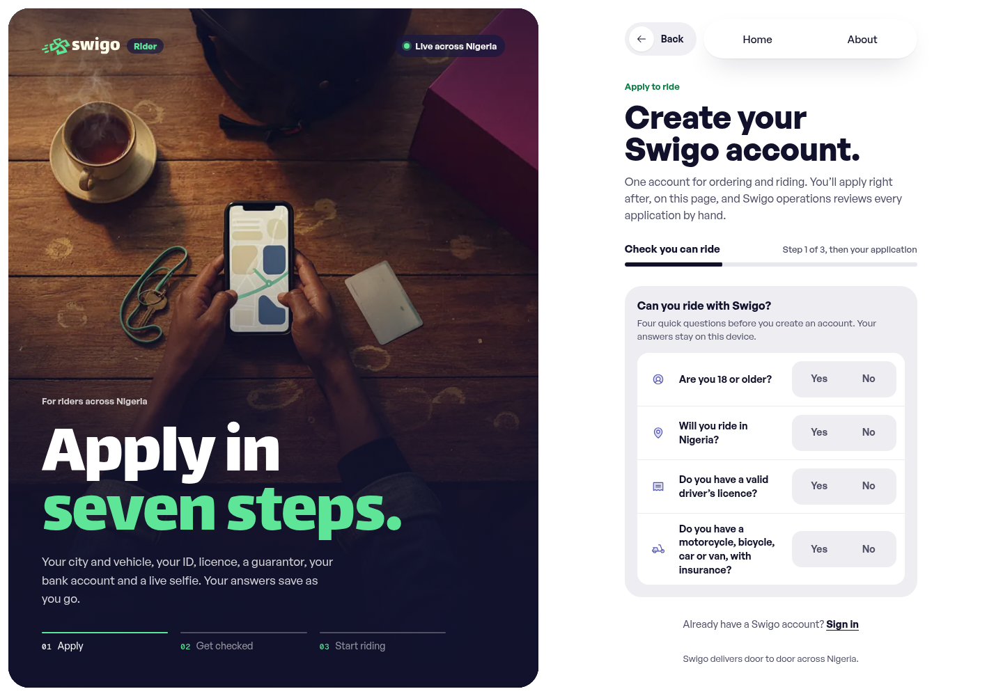
This part walks through the changes riders and customers actually see. For riders, I restructured the application so the first step only asks for city and vehicle, and heavier details like the plate number come later. A status tracker then shows where a sent application stands, from documents checked to ready to ride. The application has since grown to seven saved steps on the live site.
Inside the rider app, a short tutorial called How a shift works opens on the first idle shift and stays one tap away. On the customer side, the phone home became a grid of real services, so booking, tracking and orders are reachable without scrolling past a hero image.
A reassuring screen has to be an accurate one
To close, what I am taking from Swigo. The audit numbers taught me that a design system is mostly about saying no. Each new colour felt harmless when someone added it, and together they made the product hard to read.
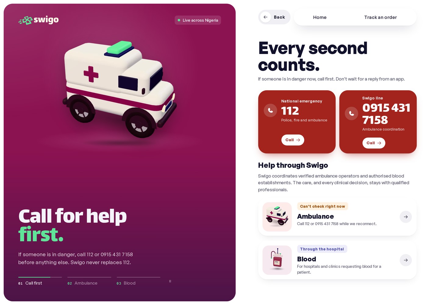
The bigger lesson is about language. An application sent is not an application approved, and a rider offered a job is not a rider assigned. As Swigo grows into pharmacy orders and emergency help, getting those words right matters even more. Swigo is live and still in progress, so this case covers the design and the code rather than delivery numbers. The next thing I would do is watch riders in Lagos use these screens on their own phones.
Based on my merged pull requests in the Swigo repository and the live Swigo site. Reviewed November 2026. Screens show the version documented in this case study.